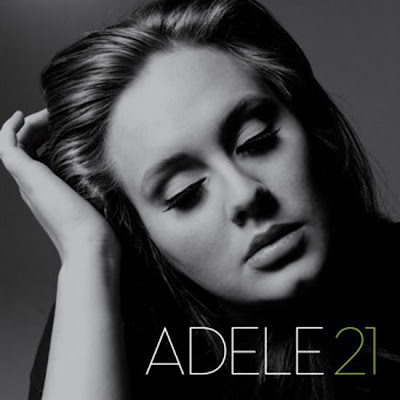
 21 is the second album released by Adele, it was released 24 January 2011 in the UK.
Media Representation
On this album cover I think that Adele is being represented as quite innocent, the way that she is not looking straight at the camera and she is looking down makes it look like she is deep in thought. The way that Adele is not smiling in this image shows that it is a serious album and the songs may not be that light hearted. After researching some of Adele's music I have found that most of her songs are quite slow love songs, and the seriousness of her songs can be seen through this image. The way that almost all of Adele's songs are about love shows her audience that she is just a normal person like everyone else and that even famous people go through these sort of issues, making the audience feel better about themselves, as they may feel that they can relate to her, and her music might even be able to help them through the problems they may be suffering by knowing they are not on their own. I think that the way this image is black and white kind of portrays innocence, and makes the image look quite pure. This suggests that the music on the album is just purely Adele's voice, with not much editing included in the music.
Media Languages and Forms
I think that the connotations of this album cover is to be as simple as possible, by just showing a close up image of Adele, her name and the title of her album may intrigue the audience and make them want to listen to the album. Anyone that has heard any of Adele's song before, even if it was just a small part of it, will know that she has a very strong voice, so this says to me that her album cover does not need to be 'glamourous' or edited a lot. I think that the connotations of Adele's facial expression on this album is possibly to show that a lot of thought has gone into the music, also as it is just a close up of her and nothing else around her, this makes her look quite independent.
Genre
The genre of this album is neo soul/blues. After researching these genres I have found that on many album covers for this genre, the album just includes an image of the artist. I think this proves my point that these kinds of artists do not have much editing in their music, and that most of the time it is just purely their voice. As this album cover is just black and white this also says to me that it is simply just Adele's voice making the album what it is, the simplicity of the album cover is made up by the music that is on the CD. Although this album cover is very simple, I think that fans of Adele and the audience that know her would not have been expecting something extravagant. Not only because this is not what Adele does but also because the conventions of this genre usually just include a simple album cover with an image of the artist. The image of Adele is also the main focus of this album cover, which is another convention of this genre, and the title is positioned in the bottom right hand corner, the image looks like Adele is looking down at the title of the album, possibly showing that she is proud of what she has achieved and this new album that she has made.
Media Institutions
Adele belongs to the record label 'Columbia Records' this is owned by the major record label 'Sony Music Entertainment' Columbia records was founded in 1888. Columbia is the oldest brand name in pre-recorded sound.
Media Values & Ideology
No comments:
Post a Comment